


On San Carlo alle Quattro Fontane
An Architectural Transcription

This Substack is by David Perrine. I write about architecture, aesthetics, design theory, and philosophy. I share new posts bi-weekly. If you enjoy my work, please consider subscribing.
As an undergraduate student, I was often asked to sketch the buildings I saw around me. The purpose of this was twofold: to help me develop my hand-drawing technique, and to force me to actively look at the building I was sketching. My first impulse was that this latter reason was stupid. I had been looking at buildings my entire life. At the time, I didn’t understand that there is a difference between looking at a building and actively looking at a building with the intention of drawing it. When one is actively observing a building, one can’t simply let their brain perceive the structure naturally. One must observe every element carefully. This process was incredibly educational. I often found that there was a huge difference between simply observing a building and actively looking at it. You learn that there are things about the building that you will never notice unless you sit down and draw it.
This was reminiscent of being a jazz musician when educators would ask me to write the musical notion of an improvised section of a jazz standard. This process is called transcribing. The exercise requires one to develop a near perfect understanding of a melody, often with the intention of reproducing it.
Although sketching a building is a great way to learn about it, using language to describe it can have a similar effect for the person producing it. These experiences are very similar for the one producing the content, but what about percieving these two methods of documentation? As one can predict, the effect of perceiving an image of a building varies greatly from reading a description of the same structure. Reading about a building forces the you to understand the building the way that the author does. This is in some sense the case with drawings, but the gap between an idea and its perception is greater. When someone sees an image of a building compared to seeing the building itself, the effects can be quite similar as both mediums are purely visually aesthetic. This is not the case with reading about a building. Reading about a building will necessarily evoke a different perception compared to seeing a sketch due the differences in the medium. It is for these reasons that the following Substack post was produced. Enjoy.
San Carlo alle Quattro Fontane, designed by Francesco Borromini, remains a significant contribution to architecture today. It is a small Catholic Church (approximately 1600 sqft) located near the center of Rome. The structure was completed in 1646 in a Borromini-esque Baroque style. It was not until graduate school that I was forced to give this building the analysis that it deserved due to a seminar on the Baroque, and, thus, I felt sharing my what makes this building noteworthy could be useful to those who hadn’t the same academic experience that I’ve had.
Most of the building’s analysis has been dedicated to either the formal qualities of its exterior front facade or interior nave. Its exterior facade appears as a curved, stone, undulating storefront on street corner. It is vertically divided into four-ish zones: two distinct stories, a thick entablature above the first story, and a sort of capital condition outlining the top edge of the facade. Each of the two stories are divided into 3 sections by a colonnade of pilasters. The capital and the thick entablature however, remain continuous horizontal bands, unbroken by the rhythm of the pilasters. The columns do, however, demarcate the inflection points in the curvature of the facade. The curvature of the facade seems to be governed by the intersection of 3 arcs, connected at their tangents points or at sharp cusps. Each of the 6 facade sections (defined by the columns and entablature) are further subdivided with smaller entablatures and columns to define frames for sculptures, windows, doors, and ornament. These columns and entablature are significantly smaller than their corresponding elements, which span the whole building. The interactions of these differently scaled elements are visually rich and enhance the poetic effectiveness of the facade greatly.

Below the entablature, the curvature is fluid. The middle arc is convex, bending out towards the street while the curves to its flanks are concave. These curves are connected at their tangent points, directly above/below the middle columns. Above the entablature, all three surfaces are defined by a concave curve. Thus, the columns at this level don’t function as a colonnade, but rather, as corner conditions. The reading is that of a triangular facade that has been unfolded and distorted to be completely visible from one side.

The nave of the church has little relation to the facade language. It is as if the facade is responding strictly to the streetscape while the interior functions as a traditional church space, completely detatched from the rest of the city.

Its interior planning is strange, and it doesn’t reflect a clear reading of any of the archetypal church planning systems. Robert Venturi described it as such:
Borromini's San Carlo alle Quattro Fontane abounds in ambiguous manifestations of both-and. The almost equal treatment of the four wings implied in the plan suggests a Greek cross, but the wings are distorted toward a dominant east west axis, thus suggesting a Latin cross, while the fluid continuity of the walls indicates a distorted circular plan.
Venturi, R. (1966) Complexity and Contradiction in Architecture. pg 27-28.
It is unclear how the geometry was rationalized, but there are some pretty good interpretations. A favorite of mine is that it was constructed with this such process outlined in Michael Hill’s “Practical and Symbolic Geometry in Borromini’s San Carlo alle Quattro Fontane.”
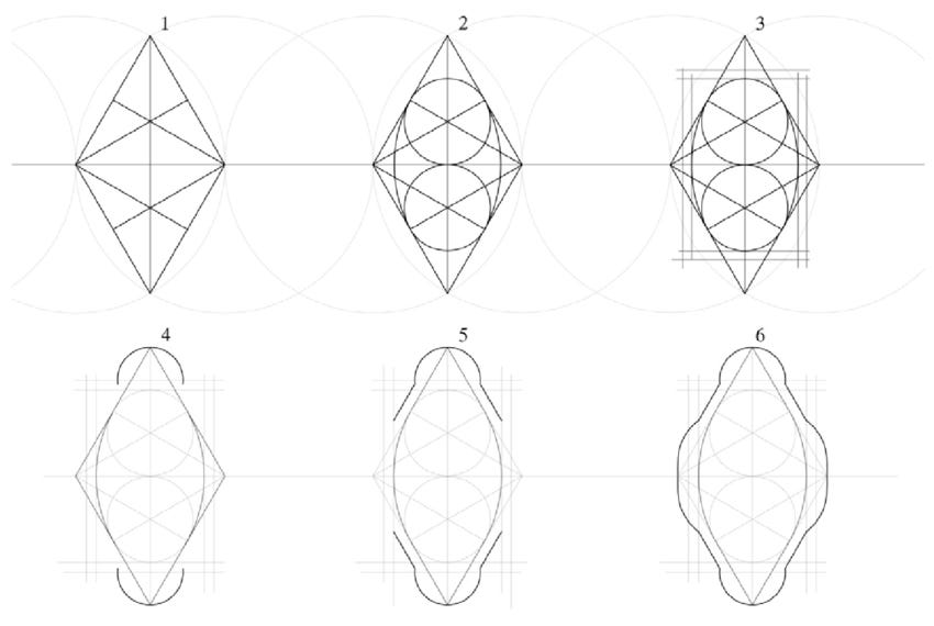
With this method, the church plan can be constructed by two equilateral triangles sharing a base. Two inscribed circles with arcs connecting at their tangent points form the geometry of the dome. Further offsets and curves are added to construct the poche and define the various wings or quadrants. Below is a plan drawing I constructed using these rationalization technics.
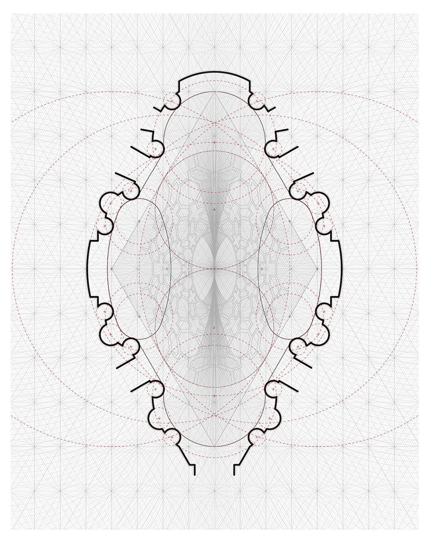
In section, the building is divided into three regions. The lowest region is occupied by the users of the space and conforms with the floor plan shown above. It possesses columns, the entrance, the alter, seating, and more. The uppermost region of the church is the oval dome defined by the two previously mentioned inscribed circles. The dome possesses a rich arrangement of coffers in various shapes including crosses, octagons, and irregular hexagons. The middle zone is made up of pendentives, arches, and half domes. Its function is to reconcile the geometric differences between the upper and lower sections of the church.

![building] The church of San Carlo alle Quattro Fontane - Francesco Borromini (1646) : r/architecture](https://substackcdn.com/image/fetch/$s_!YqRY!,f_auto,q_auto:good,fl_progressive:steep/https%3A%2F%2Fsubstack-post-media.s3.amazonaws.com%2Fpublic%2Fimages%2F1d79bb01-274d-46ac-847d-d062fdd73424_713x1201.jpeg "building] The church of San Carlo alle Quattro Fontane - Francesco Borromini (1646) : r/architecture")

Thank you for reading. Please consider subscribing.
I just came across your Substack and find it fascinating. I did a PhD in Renaissance Art History long ago at Princeton and thoroughly endorse the practice of drawing architecture. Your precise description of San Carlo can only come from a deep understanding of its geometry.
As an undergraduate we were required to take studio courses; seemingly endless hours of draftsmanship were crucial to my ability to “read” and appreciate Renaissance drawing styles and techniques. It’s a pity that so many art historians don’t draw, however poorly.
Thank you!
as a current undergrad student, this was a very insightful read. looking forward to some more!